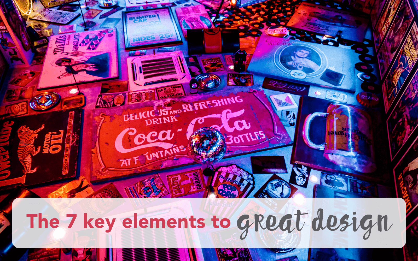
The 7 Key Elements to Great Design
“Back in my day” (four words I often use 😝) when I began learning graphic design some 20 odd years ago, we only used the Adobe Suite; Illustrator, Photoshop & InDesign, and in fact, from memory, InDesign came along way after I’d wrangled that not-so-user-friendly-beast QUARK EXPRESS 🤪😱! In our course we learned not just how to use these platforms & all the amazing intricacies of creating illustrations & graphics with the seemingly endless tools they possessed within, but also how to make your designs GOOD. In fact GREAT DESIGN that conveyed a message as well as emotion for the user/viewer.
These days with the endless design platforms that anyone can access and learn very quickly, and the need for high turnover of graphics for social media, blog posts, newsletters etc, the face of the graphic design industry has changed. But because it’s easy to create designs and spew out content for social media at a rapid rate, means there’s a plethora of oft-horrible graphics getting around, and that’s probably not what you want your brand to be known for!!!
The first thing to consider is, “who am I designing this for?” The answer on self-reflection is often ME! So strike that one straight off the bat. Design for the user, not for the designer.

Here are 7 key elements of good graphic design, and if you follow these, you’re on your way to NOT featuring on the blog posts that people search for of “examples of terrible graphic design” and let’s face it, that’s a WIN!!!!
1. Space
It goes without saying how important space is in design. Negative space for that matter. Don't be fooled by the word ‘negative’ as negative space proves to be much help in bringing an entire design together. The correct amount of negative space in your design can assist you in guiding your audience's visual flow by separating items, cushioning text to make it more readable, and encouraging them to glance at certain aspects of your design. When there isn't enough white space in a design, it seems claustrophobic and crowded. It adds to the design's object and draws attention to it. Negative space isn't the same as wasted space or a blank canvas. A blurred picture, patterns, or anything else might be used as the backdrop.

2. Balance
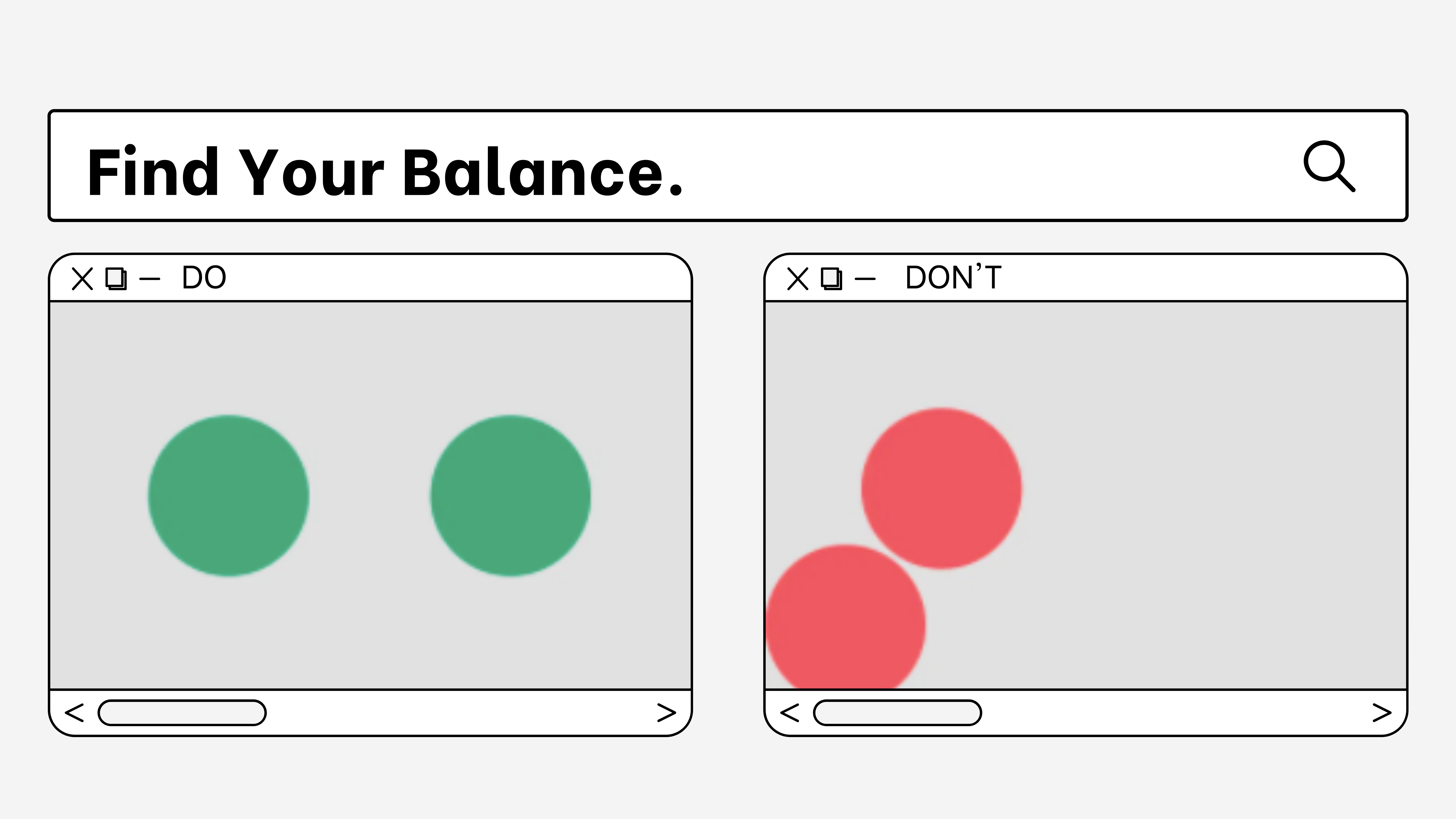
Design balance encompasses how the visual weight of elements on both sides of a design balance each other to create cohesion, completion, and satisfaction. For the best balance, your composition should be oriented vertically, horizontally, diagonally, or between the background and the foreground. A balanced work, in which the visual weight is evenly distributed over the composition, appears stable, is pleasing to the eye. An unbalanced work appears unstable, creates tension and destabilises the viewer.

3. Hierarchy
In design, visual hierarchy is essential because it establishes the relevance and order of elements in a composition. Visual hierarchy is used strategically in effective design to draw the viewer's attention to the "total" composition and guide them through its "elements" by generating distinct degrees of importance and intuitive flow. Hierarchies provide us with the structure we need to construct meaning of a design.

4. Lines & Shape
Line is used as a perimeter around certain design components or as a boundary between them to add flair, improve comprehension, create shapes, and divide space. Set tones, create textures, define forms, and build patterns with lines alone or in conjunction with other graphic design components. Shape, on the other hand, may effectively generate an amazing and effective graphic design when applied appropriately. By changing the design's shape in terms of form, colour, and size, you may improve the mood and message it conveys. Soft, curved, rounded, angled, or pointed shapes can communicate a certain mood or feeling.

5. Colour
In graphic design, colour is everything. It can be used to draw attention, organise elements, highlight aspects, evoke emotion, and make a design more appealing. Colours have influence on how we live our lives. Colours are everywhere!
Colours have meaning. Colour palettes are created by combining combinations in graphic design. Then it's time to make this colour swatch (your brand kit) work with the layout. There is a whole bunch of psychology around colours, as well as ideas on how they interact with people. You can google that for more info ... it's bloomin' fascinating!

6. Font
Your writing will be more valuable because of the typefaces you choose. Fonts help readers' comprehension of text content. The right combination of colour, font, and text size will help you attract your target audience. Font styles and fonts are particularly significant in setting the tone for communication. A typeface like Walt Disney Script creates a bright and cheerful atmosphere. The typeface chosen by the New York Times, English Towne, on the other hand, conveys a classic and somber accent. A beautiful image combined with a fantastic typeface provides your work a competitive edge and helps you communicate your message more effectively.

NB: Should I say font or typeface? A typeface is the collective name of a family of related fonts (such as Times New Roman), while fonts refer to the weights, widths, and styles that constitute a typeface (such as Times New Roman Regular, Italic, Bold, etc.) Via Mentalfloss
7. Texture
The way a surface appears or is considered to feel is called texture. Texture is used to set a visual tone and may have an impact on how a piece of graphic design looks and feels. It's also utilised to draw or repel attention to a piece based on how nice the texture is. In a piece of art, texture can be utilised to generate visual interest or a focal point in a composition. to help aesthetically arrange a design composition or to generate contrast within a design composition

Graphic design, in its most basic form, is the process of combining and harmonising all of these components to produce a design that effectively communicates your message and reflects your brand perfectly.
